
How to Create High-Converting Conversion Pages
TL;DR
- What is a High-Converting Landing Page? A page designed to prompt a specific action, like a sign-up, purchase, or download, by focusing on clear messaging and a focused user experience.
- Types of Conversion Pages: Formats such as text-only, lead generation, click-through, long-form, and video-based pages each have unique uses to drive conversions.
- Core Principles: Ensure clarity, a single call-to-action (CTA), and a simple, distraction-free design that aligns with user intent to guide visitors toward the desired action.
- Key Design Practices: Use a clean, single-column layout, ensure fast load times, and incorporate trust elements like testimonials and security badges to build credibility.
- Continuous Testing: A/B test headlines, CTAs, and form lengths regularly to optimize page performance based on real user behavior.
Achieving high conversion rates on landing pages remains a significant challenge for marketers. Despite substantial investments in driving traffic, many businesses struggle to convert visitors into customers. For instance, a study analyzing 29 billion visits to over 2,200 digital commerce sites revealed that only 1.9% of website visitors completed a desired action, such as making a purchase or signing up for a service. Conversely, implementing elements such as social proof has been shown to increase conversion rates.
This underperformance underscores the necessity for a strategic approach to landing page design and optimization. Factors like unclear messaging, cluttered design, and lack of trust signals can contribute to low conversion rates.
What Is a High‑Converting Conversion Page?
A high-converting conversion page is designed to prompt a single, specific action, such as a sign-up, download, or purchase. Instead of sending traffic to a generic homepage, smart marketers guide visitors to targeted, goal-driven pages. These conversion-focused environments remove distractions and improve response rates across digital marketing and e-commerce funnels. With the right structure and messaging, a conversion page can dramatically improve engagement and customer acquisition.
Before jumping into formats, it’s worth asking, How well do these pages actually perform across industries today?
What’s the Average Conversion Rate for Landing Pages?
Recent data shows that the average conversion rate for landing pages in 2024 and 2025 stands at approximately 2.35%. In the e-commerce sector, conversion rates typically range between 1.84% and 3.71%, influenced by design, industry, and user experience. These numbers can vary based on your target audience, the clarity of your message, and page performance. Adding social proof, such as reviews or client logos, has been shown to boost conversion rates by up to 34%.
To improve outcomes, optimize page load speed, ensure mobile responsiveness, and run A/B tests regularly. These actions help reduce friction, enhance engagement, and lift the overall performance of your conversion page.
Now, let’s break down the different types of conversion pages you can build, each with its own use case.
What Are the Types of High‑Converting Conversion Pages?
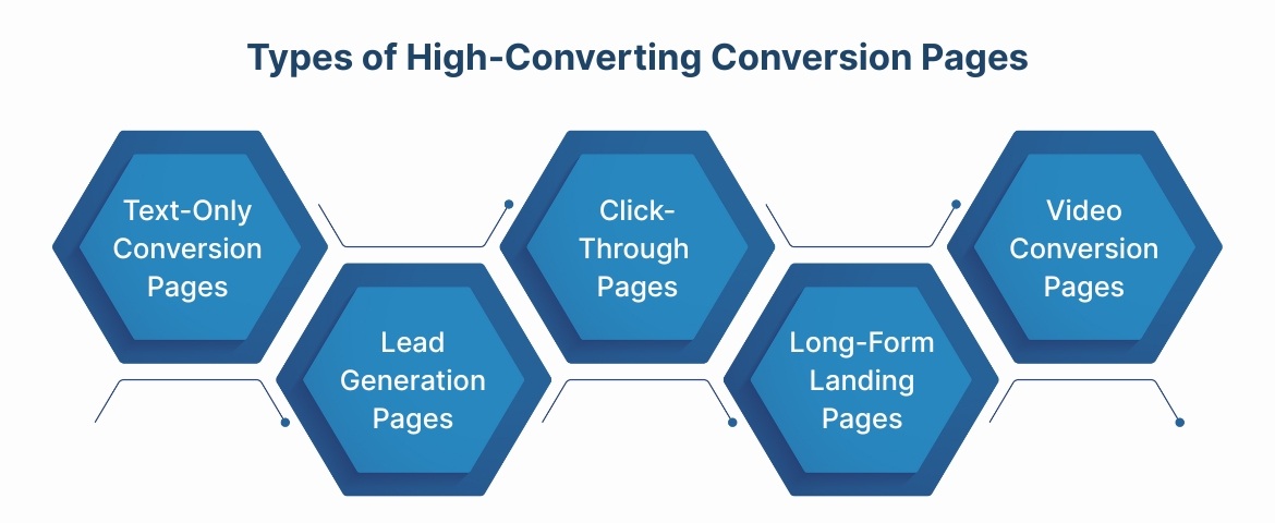
Conversion page formats vary depending on your product, audience intent, and sales cycle complexity. Each serves a distinct role in driving action.
1. Text-Only Conversion Pages
Text-only pages rely on concise messaging and a minimal layout to keep users focused on the core call-to-action. These are especially useful when promoting straightforward offers, such as a limited-time discount or simple signup. Without heavy visuals, they reduce distractions and load quickly, which benefits mobile performance and clarity.
2. Lead Generation Pages
Lead generation pages aim to collect visitor information, usually in exchange for something of value, like a whitepaper or demo. These pages often include short forms, benefit-driven headlines, and trust elements like testimonials or compliance badges. They work well for B2B campaigns where capturing qualified leads is the primary goal.
3. Click-Through Pages
Click-through pages serve as a bridge between an ad and the final transaction, such as a checkout or subscription.
Rather than asking for an immediate purchase, they warm up the visitor with key benefits or social proof.
This type is ideal when promoting free trials, product features, or early-stage consideration offers.
4. Long-Form Landing Pages
Long-form pages suit high-investment decisions or products that require in-depth explanation. They combine storytelling, detailed benefit breakdowns, objection handling, and multiple CTAs throughout the layout. When properly structured, these pages guide users through the full decision-making journey in one session.
5. Video-Based Conversion Pages
Video landing pages use engaging visual content to demonstrate value, showcase features, or humanize a brand. They help increase engagement and trust, especially for mobile users or audiences less inclined to read long text. Adding captions, clear CTAs, and supporting content below the video improves usability and accessibility.
Understanding these formats is only one part of the puzzle; how you build and align each element is where the real impact happens. Let’s go deeper into the core principles behind conversion-focused page design.
Core Principles for Building a High-Converting Conversion Page
A high-converting conversion page isn’t just about design—it’s about strategic alignment between traffic intent, content, and functionality. These core principles ensure your pages stay focused, relevant, and conversion-ready.
1. Never Send Ad Traffic to a Homepage
Sending paid traffic to your homepage dilutes intent and reduces clarity. A homepage covers too many messages, making it hard for visitors to act decisively. Instead, direct each campaign to a dedicated conversion page tailored to a single goal or audience segment.
2. Clarity and Relevance Drive Conversions
Your conversion page must match the promise made in your ad, email, or organic message. Any mismatch in tone, headline, or offer creates confusion and increases bounce rates. Keep your layout focused, your copy direct, and your value proposition immediately visible above the fold.
3. Use a Proven Page Structure
Successful pages follow a layout that guides decision-making with minimal friction. This typically includes a headline, subheadline, benefit blocks, visuals, social proof, and a single clear call-to-action. The simpler the structure, the easier it is for visitors to take action.
These principles give you the foundation. But how do you bring all of this together into a repeatable, effective design process? That’s precisely what the next section walks you through.
Also Read: What is Conversion Rate and How to Calculate It
5-Step Process to Design the Perfect Landing Page
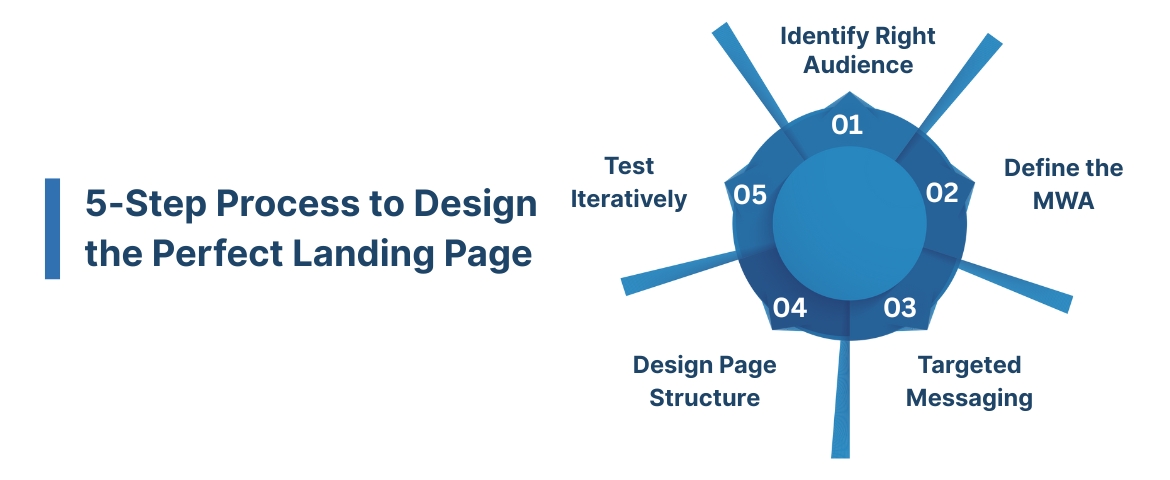
Creating a high-performing conversion page starts with precision. You need a structured approach that strikes a balance between clarity, intent, and user motivation.
1. Identify the Right Audience
Start by defining who the page is for. A clear audience profile helps you speak directly to real pain points. This reduces guesswork and improves message clarity across devices, campaigns, and user stages. Here’s how to narrow your audience focus effectively:
- Segment based on traffic source, device type, or buying stage
- Understand specific motivations, pain points, and decision triggers
- Avoid broad language that applies to everyone but converts no one
2. Define the Most-Wanted Action (MWA)
Every conversion page should drive one key outcome: this is your Most-Wanted Action. When the user’s path is clear, bounce rates drop and engagement improves.
Use these tactics to reinforce the action you want visitors to take:
- Identify a single, measurable action (e.g., book a demo, start trial, download guide)
- Align CTA text with the offer value (avoid vague “Submit” or “Click here”)
- Eliminate competing CTAs or off-page links that dilute focus
3. Craft a Clear, Targeted Message
Your message is what connects the offer to the visitor’s goal. Keep it focused, credible, and benefit-driven. Use simple, persuasive language that reinforces trust and relevance from headline to CTA. To shape a message that resonates, follow these guidelines:
- Write a benefit-first headline that mirrors the user’s intent
- Use subheadlines to clarify value or address objections
- Integrate social proof, guarantees, or urgency as needed
4. Build and Design the Page Structure
Design supports the message, not the other way around. Prioritize clarity, speed, and accessibility. Your layout should naturally guide the eye toward the CTA without visual overload. Key structural elements to include on your conversion page:
- Place the critical value and CTA above the fold
- Use whitespace to prevent cognitive fatigue
- Add trust elements like logos, star ratings, or client quotes
5. Test and Iterate Relentlessly
Once launched, your page should enter a constant improvement cycle. Testing uncovers what’s working and what’s blocking conversions. Rely on real user data, not assumptions, to evolve your content and design. Here’s what to prioritize during testing and iteration:
- A/B test headlines, CTAs, form lengths, and visuals
- Track bounce rates, scroll depth, and click heatmaps
- Test mobile versions separately to match user behavior on smaller screens
You’ve now got the blueprint. But to really lift conversion performance, you'll need to fine-tune individual elements, starting with design, copy, and SEO.
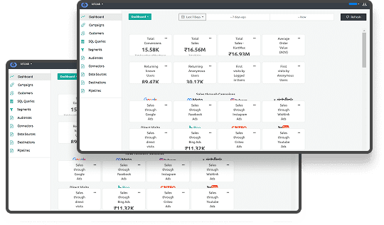
Integrate Ingest Labs' Tag Manager to streamline tag deployment and optimize your landing page’s performance with real-time tracking and analytics. Monitor user interactions and trigger data-driven insights for personalized user journeys and enhanced conversion rates.
Landing Page Optimization Best Practices
Building a conversion page is only the start. To consistently drive results, refine your design, copy, and SEO with proven techniques. These best practices help reduce friction, improve relevance, and increase conversions.
1. Design Best Practices
Strong visual design builds trust, guides behavior, and keeps attention on the call-to-action. Every element should serve the goal. Here are key design strategies to optimize your conversion page:
- Use a single-column layout to improve focus and readability
- Ensure fast page load times, especially on mobile
- Apply visual hierarchy using bold text, spacing, and contrast
- Include trust signals like security badges, client logos, or media mentions
- Keep forms short, ask only for the essentials
2. Copywriting Best Practices
Effective copy guides visitors toward action by focusing on value, clarity, and confidence. It should speak directly to the intent behind the visit. Apply these copywriting techniques to drive stronger engagement and action:
- Lead with a compelling, benefit-driven headline
- Use subheadlines to reinforce value or clarify details
- Write in short paragraphs with active, direct language
- Highlight pain points and how your offer solves them
- Add social proof like testimonials or customer stats
3. Landing Page SEO Best Practices
Even conversion pages need to be discoverable. Optimizing for search ensures your page attracts the right traffic at the right time. To improve organic visibility, follow these on-page SEO best practices:
- Include the target keyword in the title tag and meta description
- Optimize images with descriptive alt text
- Use H1 and H2 headers to structure content clearly
- Ensure your page is mobile-responsive and uses HTTPS
- Minimize render-blocking elements that hurt crawl speed
It’s one thing to follow best practices. It’s another to see how top-tier brands put them into action. Let's walk through three real-world examples that do this exceptionally well.
To boost your landing page performance, Ingest Labs' Site Performance keeps an eye on your page load times and helps pinpoint any issues that might slow down your site.
Plus, with Ingest IQ's tag monitoring, you can make sure all your tags are running smoothly, giving you the insights you need to optimize every visitor interaction.
Also Read: How to Conduct Customer Journey Analysis: Practical Steps and Techniques
Examples of High-Converting Landing Pages
Not all landing pages convert well, but the ones that do tend to follow a clear pattern: clarity, trust, focus, and user-first experiences. Below are three standout examples from well-known brands, including what you can learn from each.
1. Apple – Product Launch Landing Page
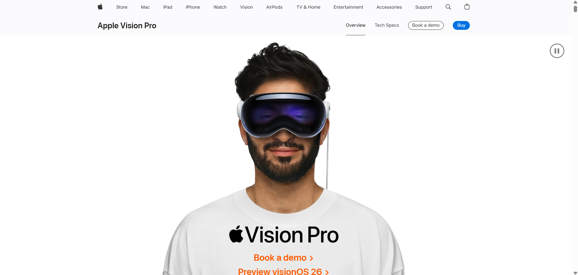
Apple’s launch pages are designed with precision. There’s minimal text, stunning visuals, and one clear call to action: Book a demo and preview Vision Os 26. Instead of overselling, Apple lets its product speak visually, backed by subtle animations and clean layout transitions. Everything about the page, from the typography to the spacing, makes it easy to scroll, absorb, and convert.
What works:
- Focused CTA that appears repeatedly without clutter
- Strategic use of white space and product visuals
- No navigation bar to reduce exit options
- Emotional resonance through cinematic visuals
Takeaway for your brand:
When introducing a flagship product or feature, keep the landing page clean and emotionally focused. Use strong visuals and repeat a single CTA consistently without distractions.
2. Monday.com – Workflow Automation Free Trial Page
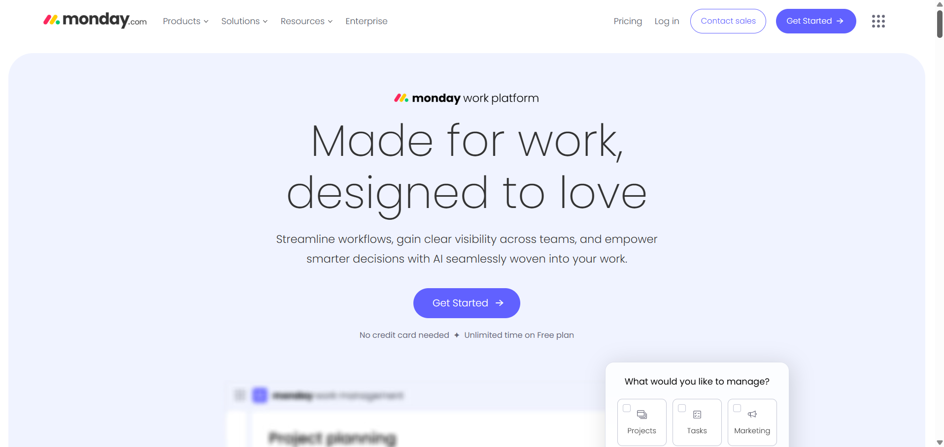
Monday.com’s landing page blends emotional appeal with functional clarity. The headline, “Made for work, designed to love,” positions the product as both powerful and easy to adopt. Instead of diving into features, it targets key pain points: workflow efficiency, visibility, and AI-powered decisions. The “Get Started” CTA is bold, above the fold, and requires no credit card, lowering entry friction.
Below, interactive tiles let visitors choose what they want to manage (Projects, Tasks, Marketing), personalizing the experience without a lengthy form.
What you can apply:
- Lead with emotionally charged, benefit-driven messaging
- Highlight easy, risk-free onboarding (no credit card, free plan)
- Add early personalization through visual prompts
- Keep the design clean and focused on one action
3. HelloFresh – Meal Subscription Offer Page
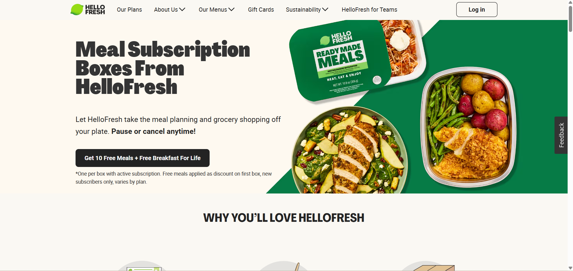
HelloFresh’s landing page is a masterclass in conversion-focused clarity. The headline instantly sets expectations:
“Meal Subscription Boxes From HelloFresh.” There’s no fluff—just a direct pitch that aligns with user intent.
The supporting text solves a daily frustration: “Let HelloFresh take the meal planning and grocery shopping off your plate.” That’s paired with one powerful reassurance: “Pause or cancel anytime.” Together, they reduce commitment anxiety and build trust fast.
What drives the most attention is the bold black CTA box:
“Get 10 Free Meals + Free Breakfast For Life.”
It’s urgent, tangible, and highly visible. This hooks cost-conscious visitors and nudges them to act without overthinking.
Visuals on the right showcase exactly what you’re getting—colorful, healthy, ready-to-eat meals. That removes guesswork and creates desire. The absence of clutter keeps the user focused on one action: clicking that CTA.
What you can apply:
- Use a clear, no-jargon headline tied to your product’s format or category
- Present strong incentives upfront (e.g., free meals, discounts, lifetime perks)
- Pair value offers with low-commitment messaging to ease friction
- Include real product visuals that reinforce the offer with authenticity
How Can You Apply These Patterns?
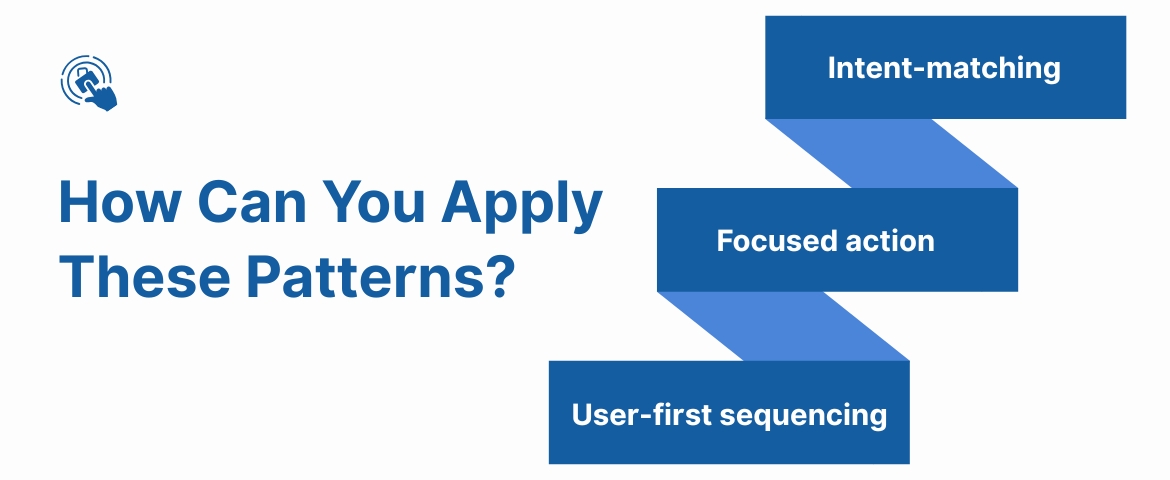
High-performing conversion pages from top brands share three traits:
- Intent-matching: Every visual, word, and feature aligns with a specific user journey.
- Focused action: One clear CTA, placed consistently and surrounded by reinforcement cues.
- User-first sequencing: Give value before asking for input, whether that’s pricing, testimonials, or visuals.
As you design your own landing page, consider what matters most to your visitor at that moment—and remove everything else.
With Ingest IQ, you can quickly set up and manage server-side tags with no coding required, boosting your site's performance and keeping everything privacy-friendly. Plus, it integrates smoothly with tools like the Facebook Conversion API for accurate tracking.
Final Thoughts
Creating a high-converting conversion page is less about flashy design and more about clarity, alignment, and purpose. When your messaging speaks directly to user intent and your page removes friction at every step, you create a smoother path to action. Whether you're aiming to boost sign-ups, drive purchases, or collect qualified leads, the structure and relevance of your conversion page play a central role in the outcome.
For brands looking to back their conversion efforts with stronger data and customer insights, Ingest Labs brings the technology to make it happen. Their server-side tracking platform, Ingest IQ, ensures accurate, privacy-compliant data capture across web and mobile. Tools like Ingest ID assign unique identifiers to each visitor, making attribution and personalized engagement simpler and more precise.
Meanwhile, Event IQ unifies cross-platform data, offering campaign insights and user journey visibility at scale. From reducing cart abandonment to powering cross-channel messaging and real-time segmentation, Ingest Labs equips marketing and growth teams with tools to track, personalize, and convert without guesswork.
Struggling to build a high-converting conversion page that actually delivers results? Contact Ingest Labs to turn your data into decisions that convert.
FAQ
1. How to create a high-conversion landing page?
Focus on clear messaging, a strong call to action, user-friendly design, and persuasive content that speaks to your target audience's needs.
2. How to create a high-converting product page?
Highlight product benefits, use high-quality images, include customer reviews, and have a clear, compelling CTA to guide users toward making a purchase.
3. How to improve the conversion rate on the landing page?
Optimize your copy, design, and CTAs, use A/B testing to find what works, and ensure a smooth user experience with fast loading times and mobile optimization.
4. What makes a landing page good at converting?
A clear value proposition, easy navigation, trust signals (like testimonials), compelling CTAs, and a design that focuses on the user’s needs all contribute to higher conversions.
5. How to increase landing page speed?
Compress images, minimize scripts, use a content delivery network (CDN), and optimize code to improve load times for a better user experience and conversion rates.
6. Which is the most effective call to action on a high-conversion landing page?
A simple, action-oriented CTA like “Get Started” or “Sign Up Now” that creates urgency and clearly tells users what to do next works best for conversions.